
This tutorial is the second in our series about creating & editing pages using the WordPress Blocks editor. It follows on from Part One: Basic Editing Concepts.
Working with Paragraphs
We have already starting working with paragraph blocks, the basic element that makes up most of our page content. Now we’ll look at how to add markup and styling to our paragraphs blocks.
A note about visual styles
If you’ve worked with a word processor before, you probably know how to change the appearance of your text. However, when writing for a web page, we’re not just thinking about looks—we’re thinking about the structure and purpose of our text.
For example, you could make some text look like a heading by making it bold and changing the colour—but that doesn’t make it an actual heading! The correct way to do this is to add a Heading block (demonstrated later in the tutorial).
Structure helps browsers understand your page better, and it allows your WordPress theme (which determines the overall look of your site) to apply a consistent, attractive appearance across the entire site. As you work with text, a less-is-more approach to visual styles will help you create great content that looks perfect within your theme.
Text Markup
We’ve already discussed the important of text content on your website. To help us communicate clearly with text, we can also mark certain words and phrases as requiring emphasis or strong attention. We can also add links to the text, to help visitors navigate between our content. Think of it as “tagging” a fragment of your text with additional information or context.
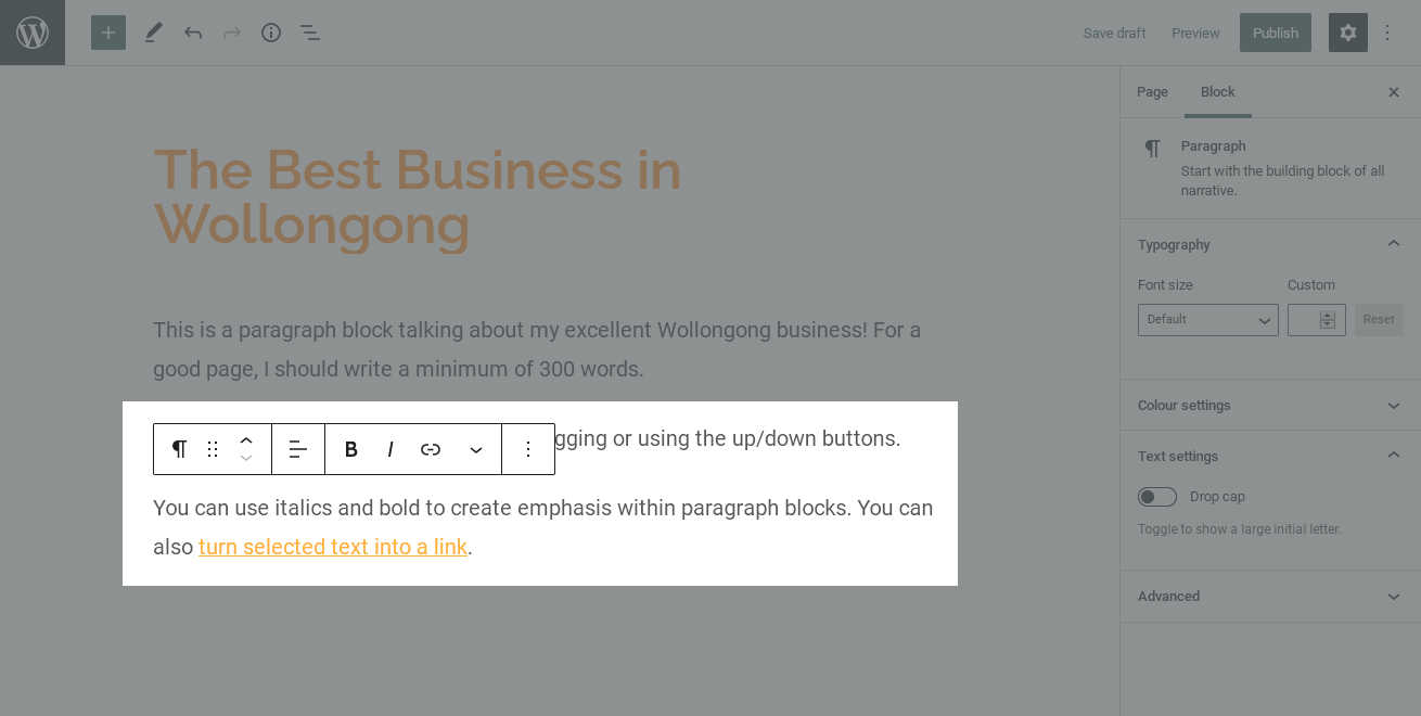
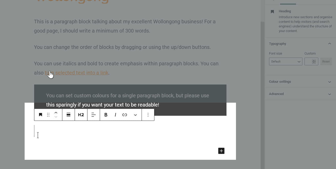
While you have a paragraph block selected, you can see buttons to add markup (along with a few other) in the toolbar that appears above. First, we must select the text we want to tag. Click and drag the cursor to select some text within the paragraph block.
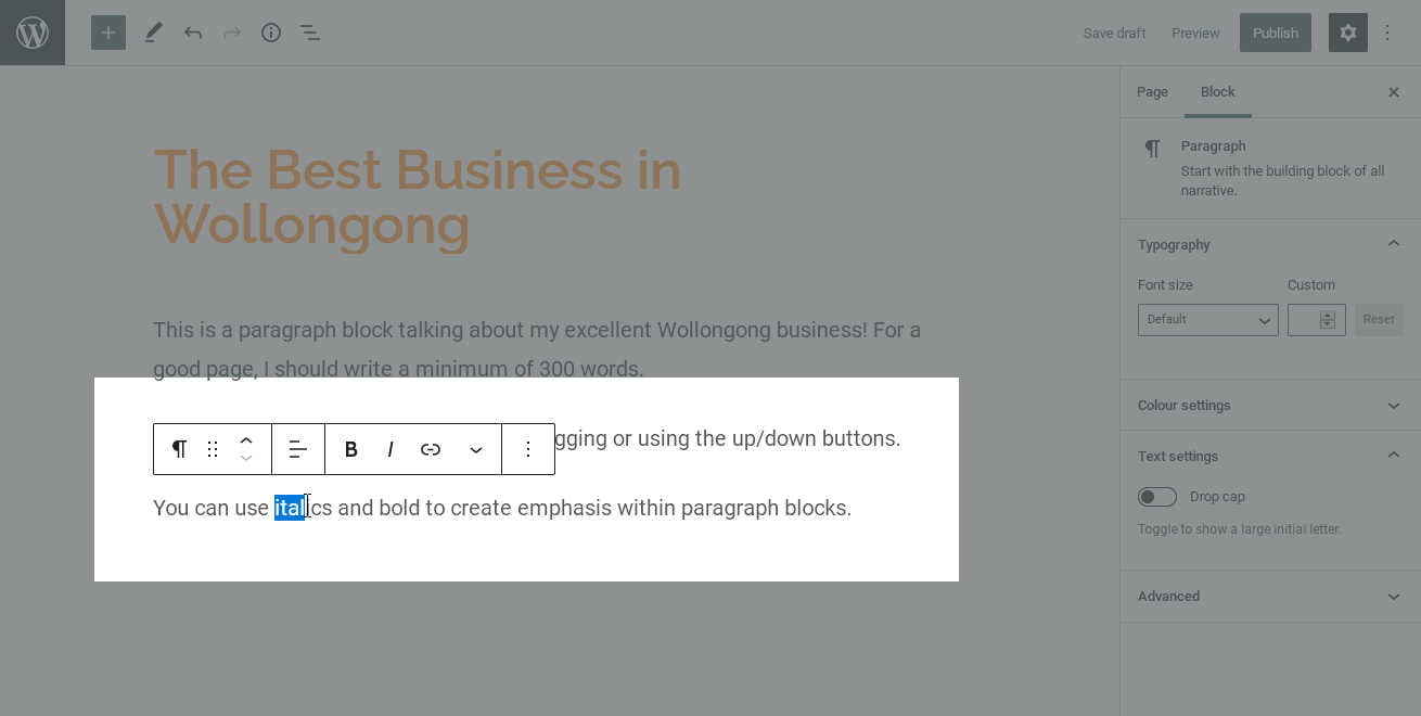
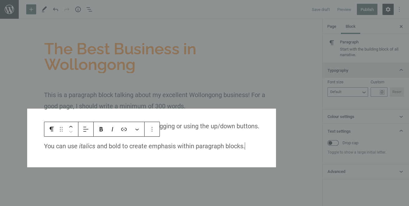
First, the ɪ button tags the text as requiring emphasis. Most themes display emphasis text in italics, but this can be changed by a theme designer, so don’t think of it as simply visual styling.
%22%20transform%3D%22translate(2.6%202.6)%20scale(5.11719)%22%20fill-opacity%3D%22.5%22%3E%3Cellipse%20fill%3D%22%23e0e0e0%22%20cx%3D%2291%22%20cy%3D%2280%22%20rx%3D%2280%22%20ry%3D%2229%22%2F%3E%3Cellipse%20fill%3D%22%23656565%22%20rx%3D%221%22%20ry%3D%221%22%20transform%3D%22matrix(30.54672%20-4.40185%2020.02814%20138.98567%20229.3%2035)%22%2F%3E%3Cellipse%20fill%3D%22%236a6a6a%22%20rx%3D%221%22%20ry%3D%221%22%20transform%3D%22matrix(-239.83129%2011.89308%20-.90388%20-18.2274%2033.6%200)%22%2F%3E%3Cpath%20fill%3D%22%23707070%22%20d%3D%22M197.5%2040.8l-44.7-51.6-.7%209.2%2050%209.7z%22%2F%3E%3C%2Fg%3E%3C%2Fsvg%3E)
Setting the selected text to italic %22%20transform%3D%22translate(2.6%202.6)%20scale(5.11719)%22%20fill-opacity%3D%22.5%22%3E%3Cellipse%20fill%3D%22%23e0e0e0%22%20cx%3D%2289%22%20cy%3D%2280%22%20rx%3D%2280%22%20ry%3D%2231%22%2F%3E%3Cellipse%20fill%3D%22%23666%22%20rx%3D%221%22%20ry%3D%221%22%20transform%3D%22rotate(163%20110.5%2026.6)%20scale(36.7423%20230.37578)%22%2F%3E%3Cpath%20fill%3D%22%236a6a6a%22%20d%3D%22M-52-4.8l229.3-28.1L182%204.8-47.3%2032.9z%22%2F%3E%3Cellipse%20fill%3D%22%23a5a5a5%22%20rx%3D%221%22%20ry%3D%221%22%20transform%3D%22matrix(20.91605%20-10.33736%2018.25815%2036.94257%20182%2060.5)%22%2F%3E%3C%2Fg%3E%3C%2Fsvg%3E)
The selected text is now italic
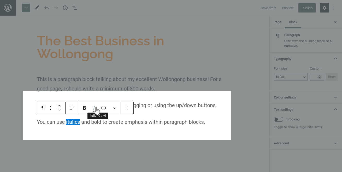
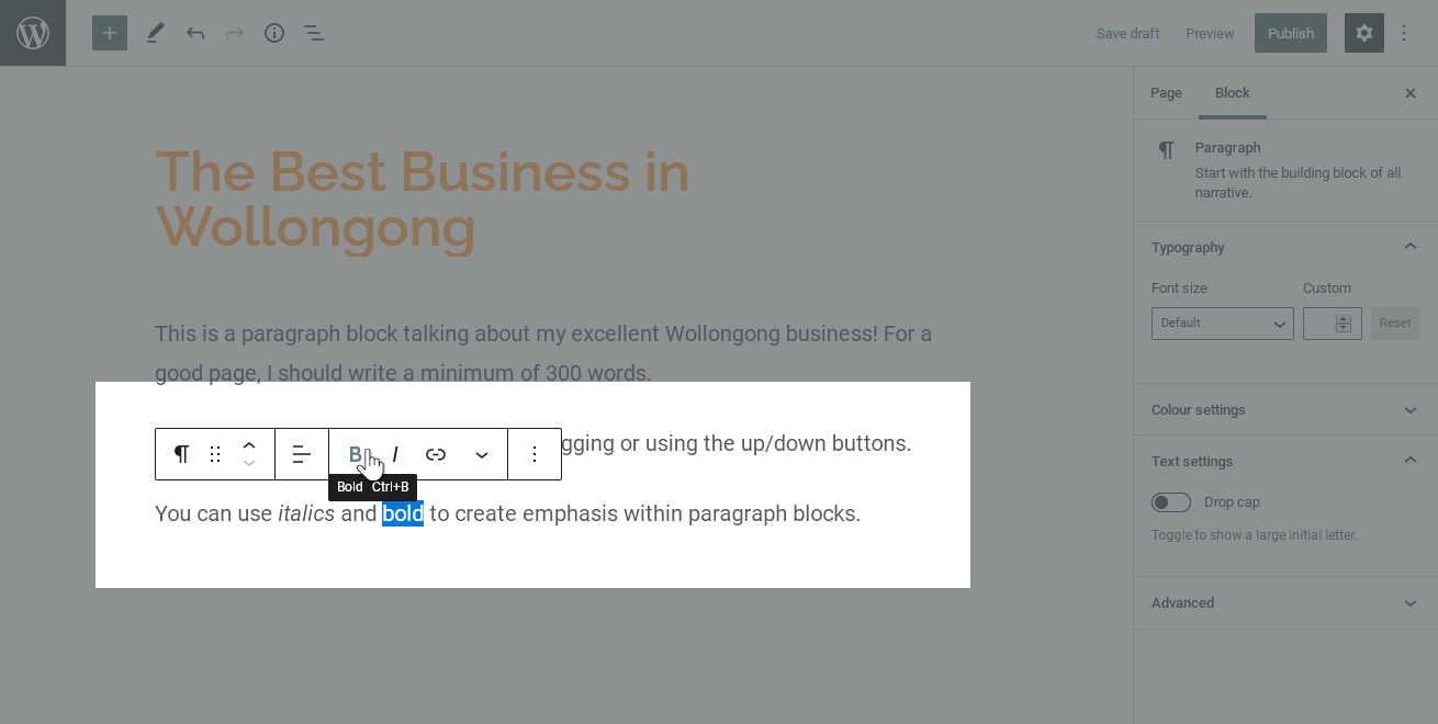
Alternatively, the B button tags the text as requiring strong attention to serious or urgent information. Most themes display this in bold—but, once again, this depends on your theme.
Adding Links
Finally, we can also make selected words or phrases into links. Links are a great tool for helping visitors navigate your content and find related information. Especially for big sites, taking the time to interconnect pages and articles through links, makes your content much more approachable.
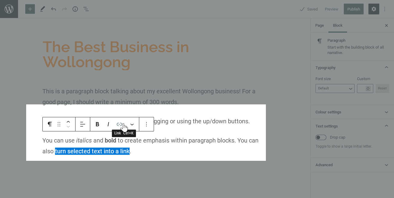
When we tag some text as being a link, WordPress opens a small popup where we can enter the destination of our link. This could be another page on our site, a file we have uploaded, or another website entirely—as long as it’s available online, we can link to it.
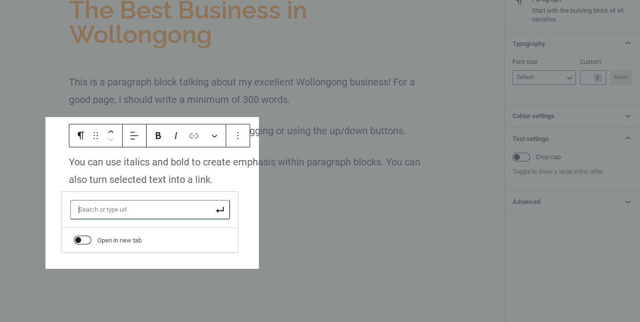
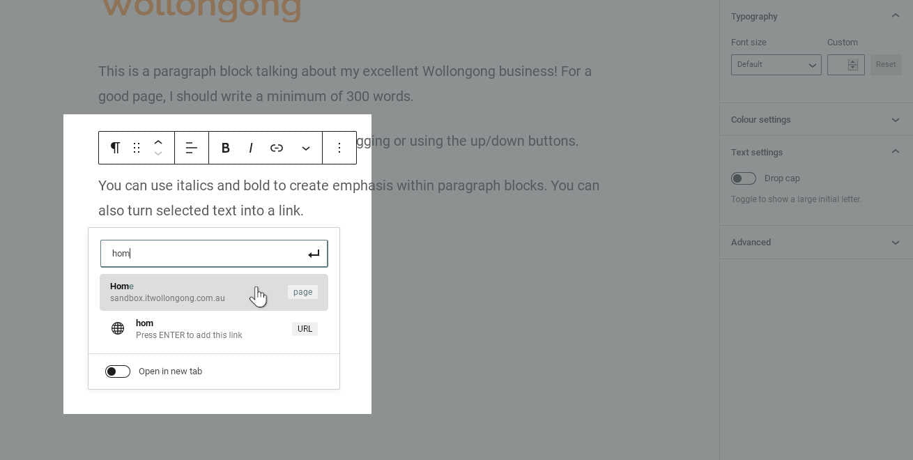
- Internal Link: If we want to link to a page on our site, we can start typing the title and WordPress will show a list of our content that matches the text. The more characters we type, the more we will narrow down the list. Once we see the page we want, we can click on it to select it, and WordPress will fill the correct address into the box.
- External Link: If we want to link to some other site, we must know its exact web address (URL). Type the address into the box, or copy and paste it from an existing source.
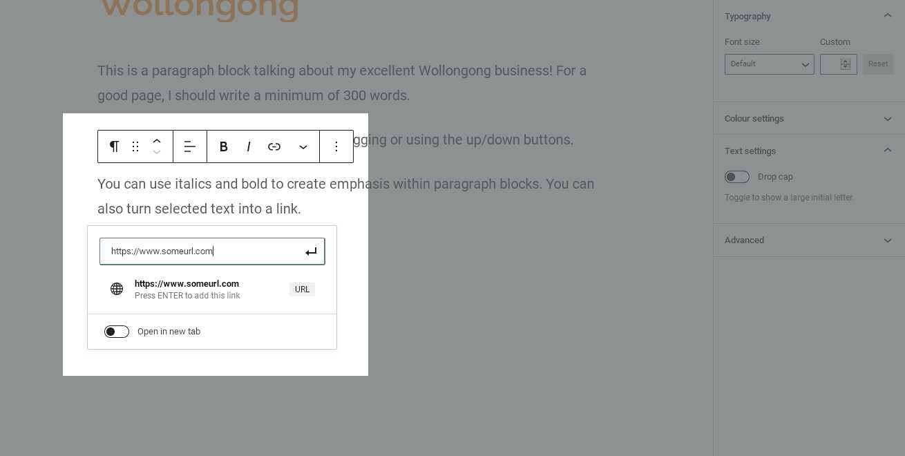
Once our link text is correct, we’ll click the “Apply” button (or press enter) to create the link.
In most themes, text links are highlighted with an accent colour. They are often also underlined. This styling has been typical since the earliest web browsers, so it helps visitors identify links easily. This is also a good reason to avoid using highlight colours or underlines purely for decoration—you don’t want to confuse links with ordinary text!
Background and Text Colours
Many content Blocks, paragraphs included, also let us apply background and foreground colours. A quality theme will provide a palette of colours coordinated with the theme’s appearance, so you have a multiple options that always match with your site’s overall style.
In the case of a paragraph block, applying a background colour essentially draws a coloured box around a single paragraph. This is useful if we want to highlight a single paragraph—for example, to create a “notice” box. However, we should remember to use these sparingly, as they can quickly become overwhelming and make a page unreadable. As always, with great power comes great responsibility!
To add highlight colours to a paragraph, look in the “Block” tab of the right-hand sidebar menu. This tab displays options that are specific to the current block type, so they change depending on which block you have selected.
Right now, you should the styling options for a paragraph block. One of these is a “Colour Settings” section, which contains options for Background Colour and Text Colour. (If you don’t see the colour palettes, you might need to click the ⌄ button next to “Colour Settings” to toggle the section.)
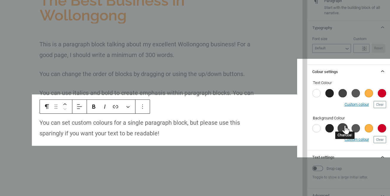
Click on the circle showing the colour you want for each option, and a tick will appear over the selected colour. To return the block to its default colour, click the ticked colour again to deselect it, or click the “clear” button.
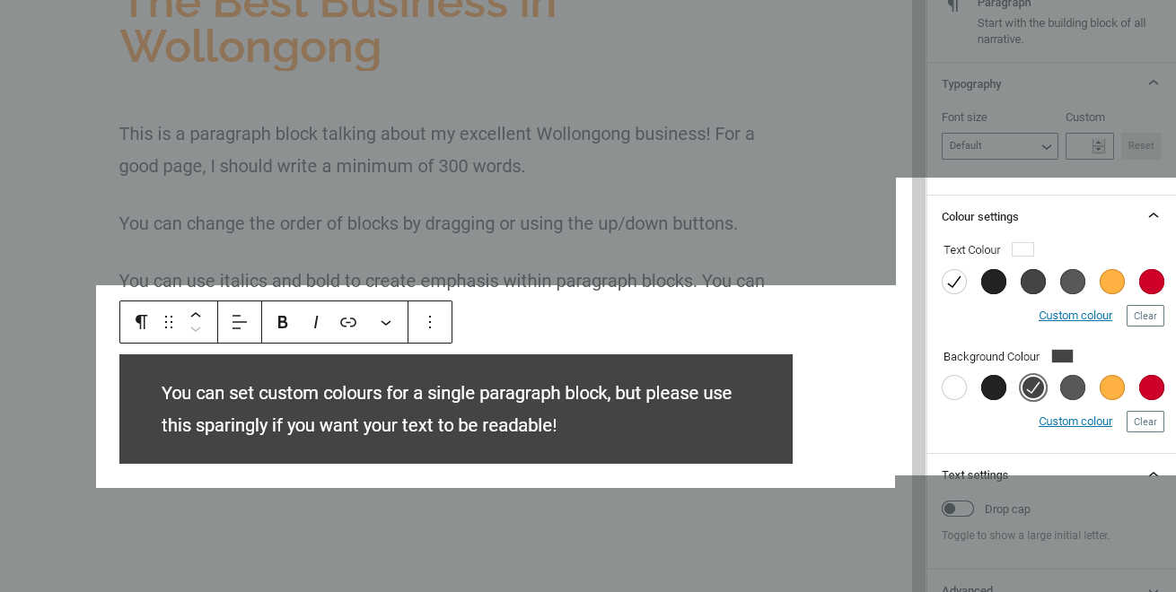
We should see our choices applied immediately to the block. WordPress will show a warning if the colours are too similar to one another, and we should pay attention—after all, we don’t want to make our text impossible to read!
Working with Headings
Once we have a significant amount of text content on our page, we need to start breaking it up into sections. This helps readers keep their place, and quickly seek out information they want, without getting lost in a wall of text.
To organise our content, we need to add some Headings. A Heading is its own block type, so we start by clicking the “Add Block” button. Then, select “Heading” from the Text Blocks group.
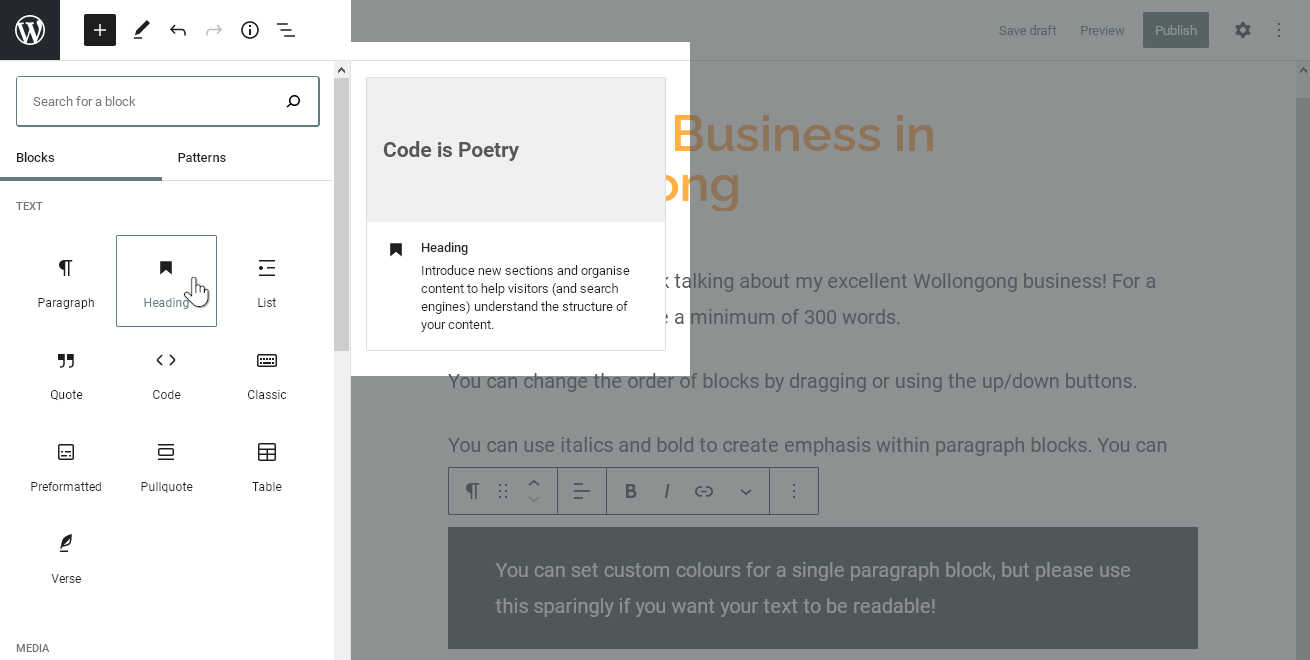
This will create a new, empty Heading block. It looks a lot like a paragraph block, except the buttons on the toolbar are a bit different. They show various “levels” of heading, which allow us to create more and more specialised sub-sections within our page.
Once we start typing, we should see the difference right away. Our new heading has inherited the style set by our theme for a second-level Heading (H2), which is the default when we add a new Heading block. Since our Title will become the first-level (H1) tag, this is the correct heading level for our first section.
We will follow this heading with more paragraph blocks and other content. Since a heading is typically followed by a paragraph, that’s what happens if we press enter while editing a heading block—we move on to a new paragraph block.
Lower-level Headings
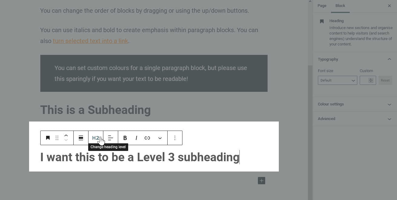
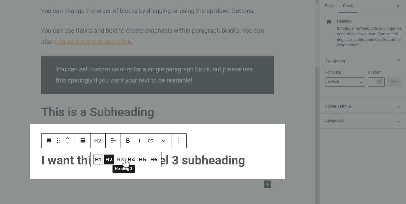
Eventually, we may add enough content that we want to divide up the section we just made into sub-sections. We can do that by adding a third-level, or H3 heading. If we need to make even more specialised sections later, we can continue into H4, H5 and even H6.
Like before, we add a new heading block and type our text. Then, we click the “H3” button on our toolbar. The heading is now set to level 3, and inherits slightly different styling from our theme.
%22%20transform%3D%22translate(2.6%202.6)%20scale(5.11719)%22%20fill-opacity%3D%22.5%22%3E%3Cellipse%20fill%3D%22%23e3e3e3%22%20cx%3D%22100%22%20cy%3D%22108%22%20rx%3D%2276%22%20ry%3D%2237%22%2F%3E%3Cellipse%20fill%3D%22%236b6b6b%22%20cx%3D%22143%22%20cy%3D%2224%22%20rx%3D%22255%22%20ry%3D%2231%22%2F%3E%3Cellipse%20fill%3D%22%236f6f6f%22%20rx%3D%221%22%20ry%3D%221%22%20transform%3D%22matrix(14.91227%20-26.72155%2022.9697%2012.81851%20235.9%2075.2)%22%2F%3E%3Cellipse%20fill%3D%22%23aeaeae%22%20rx%3D%221%22%20ry%3D%221%22%20transform%3D%22matrix(-23.95853%2024.69808%20-29.5318%20-28.64752%20174.6%2087)%22%2F%3E%3C%2Fg%3E%3C%2Fsvg%3E)
Changing a Heading block from H2 to H3 %22%20transform%3D%22translate(2.6%202.6)%20scale(5.11719)%22%20fill-opacity%3D%22.5%22%3E%3Cellipse%20fill%3D%22%23e2e2e2%22%20rx%3D%221%22%20ry%3D%221%22%20transform%3D%22rotate(83.7%20-15.2%20108)%20scale(39.81231%2085.41471)%22%2F%3E%3Cellipse%20fill%3D%22%236a6a6a%22%20cx%3D%22142%22%20cy%3D%2224%22%20rx%3D%22255%22%20ry%3D%2231%22%2F%3E%3Cpath%20fill%3D%22%236b6b6b%22%20d%3D%22M207.7%2053.3l50.4-8%208.2%2051.4-50.4%208z%22%2F%3E%3Cellipse%20fill%3D%22%23acacac%22%20rx%3D%221%22%20ry%3D%221%22%20transform%3D%22matrix(18.49993%20-18.05112%2026.95602%2027.62624%20180%2083.2)%22%2F%3E%3C%2Fg%3E%3C%2Fsvg%3E)
Selecting a H3 heading
Changing a paragraph to a heading
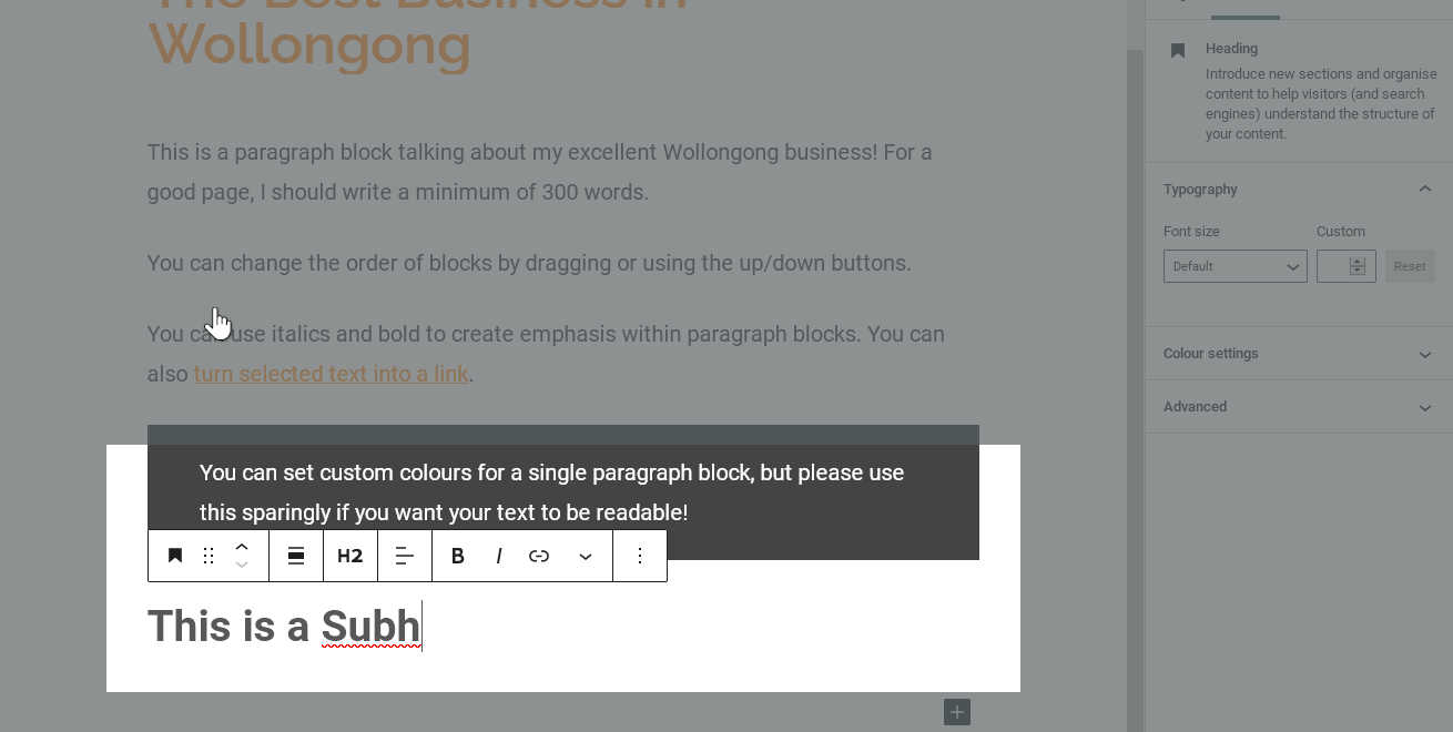
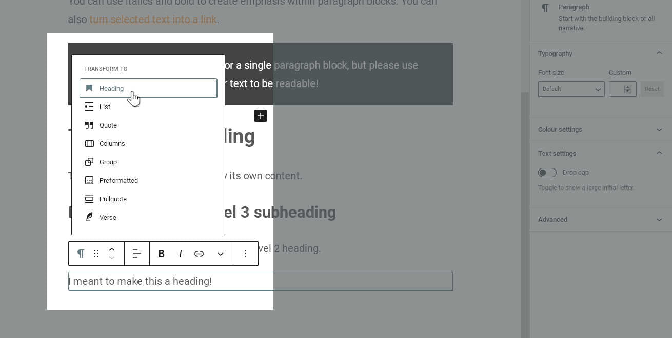
So, what happens if we type a paragraph, but then decide it should be a heading? In the Blocks editor, some block types can be “transformed” into others which are similar. Fortunately, since a paragraph is very similar to a heading, we can easily transform this one.
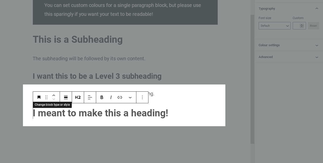
In the toolbar that appears above our current selected block, the first button is an icon representing the block type. (For a paragraph block, this is ¶.) When we move our cursor over this icon, the tooltip shows that we can change the block to a different type.
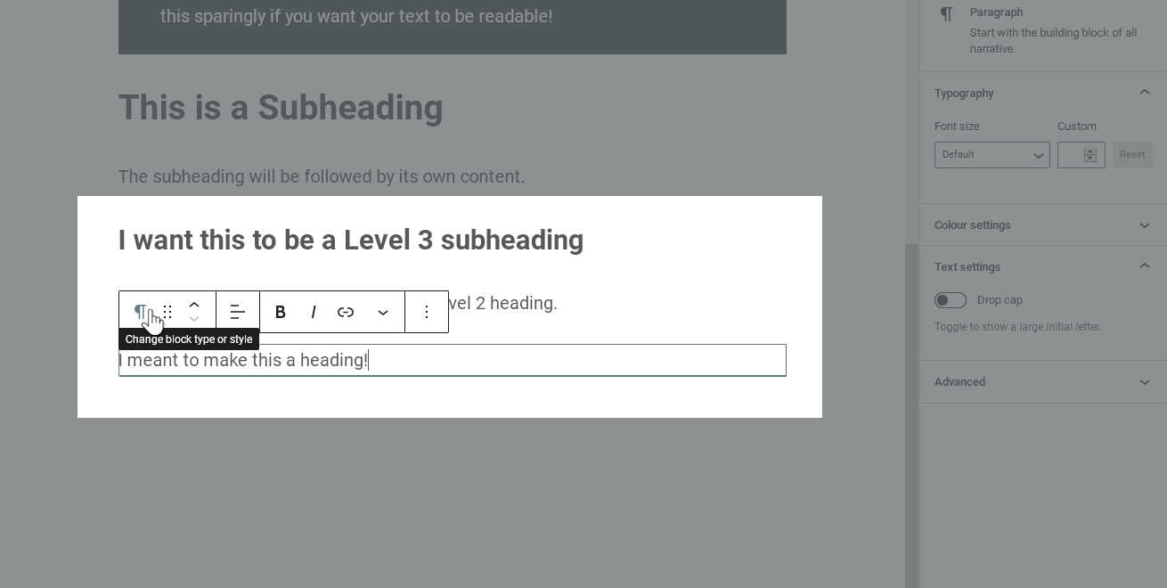
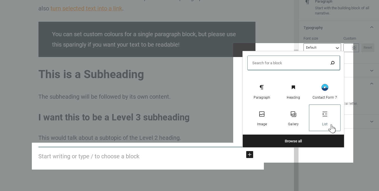
When we click on this button, we see a short list of other block types. These are blocks which are similar enough to be Transform targets for the current block type. (If we selected some other block type, we would see a different list.) In this case, we simply need to select “Heading”. Immediately, our paragraph block becomes a Heading block!
%27%20fill-opacity%3D%27.5%27%3E%3Cellipse%20fill%3D%22%23f9f9f9%22%20fill-opacity%3D%22.5%22%20rx%3D%221%22%20ry%3D%221%22%20transform%3D%22matrix(305.88198%20-18.28311%2023.85035%20399.02365%20222.8%20421.5)%22%2F%3E%3Cellipse%20fill%3D%22%23626262%22%20fill-opacity%3D%22.5%22%20rx%3D%221%22%20ry%3D%221%22%20transform%3D%22rotate(-117.5%20523.6%20-217.8)%20scale(1062.54955%20369.28156)%22%2F%3E%3Cellipse%20fill%3D%22%23f2f2f2%22%20fill-opacity%3D%22.5%22%20rx%3D%221%22%20ry%3D%221%22%20transform%3D%22matrix(65.16797%20207.84625%20-152.81672%2047.91405%20283.4%20371)%22%2F%3E%3Cellipse%20fill%3D%22%23b6b6b6%22%20fill-opacity%3D%22.5%22%20rx%3D%221%22%20ry%3D%221%22%20transform%3D%22matrix(-424.03663%20431.65096%20-59.90167%20-58.845%2017.8%20237.8)%22%2F%3E%3C%2Fg%3E%3C%2Fsvg%3E)
Available blocks to transform a paragraph into %22%20transform%3D%22matrix(4%200%200%204%202%202)%22%20fill-opacity%3D%22.5%22%3E%3Cellipse%20fill%3D%22%23e3e3e3%22%20cx%3D%22109%22%20cy%3D%2278%22%20rx%3D%2268%22%20ry%3D%2225%22%2F%3E%3Cellipse%20fill%3D%22%23636363%22%20cx%3D%22135%22%20cy%3D%2210%22%20rx%3D%22255%22%20ry%3D%2226%22%2F%3E%3Cellipse%20fill%3D%22%236d6d6d%22%20cx%3D%22233%22%20cy%3D%2253%22%20rx%3D%2228%22%20ry%3D%2226%22%2F%3E%3Cpath%20fill%3D%22%23464646%22%20d%3D%22M136.5%209.5h-85v-19h85z%22%2F%3E%3C%2Fg%3E%3C%2Fsvg%3E)
We transformed our Paragraph into a Heading
Don’t Forget! Headings are not meant for decoration. You should only use them to organise your text content into sensible sections. If you just want some text that looks big and bold, use a bolded paragraph block with a custom size instead!
Working with Lists
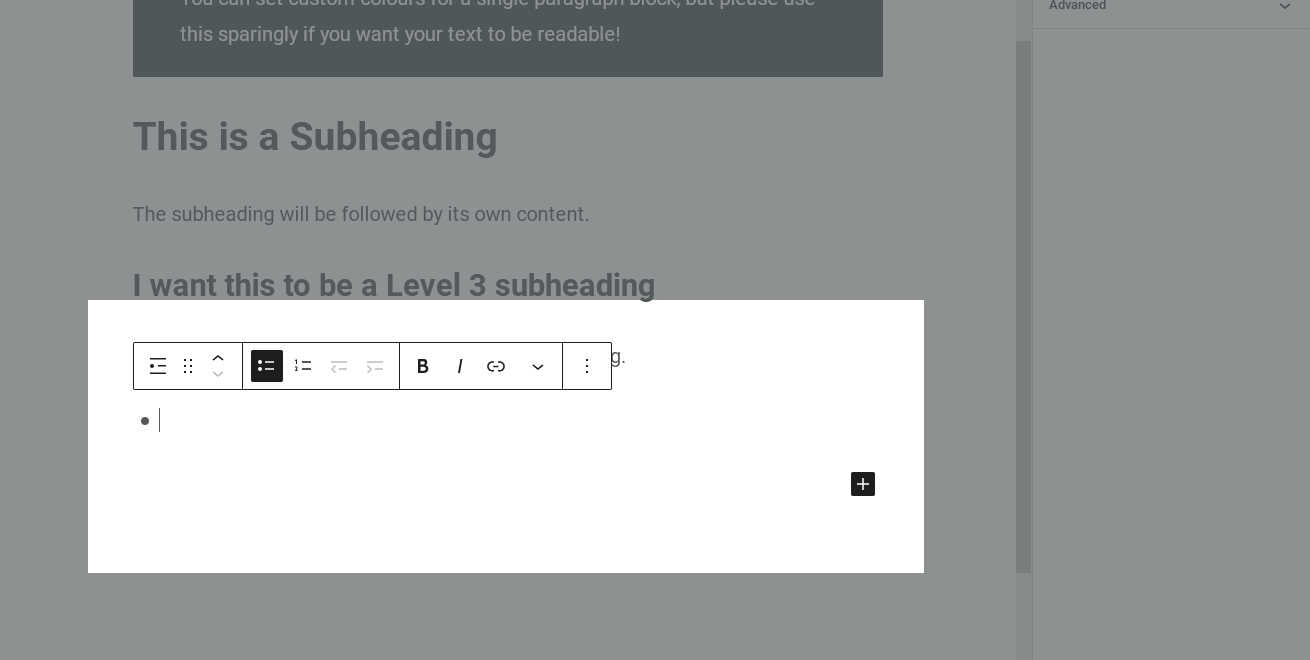
Often when we write a page, we want to add a short summary of items that are less than a paragraph in length. In these cases, what we need is a List block.
Like headings and paragraphs, this block can also be found under the Common Blocks group. Our new list block appears with a single empty bullet point, ready for us to add our items.
%22%20transform%3D%22translate(2.6%202.6)%20scale(5.11719)%22%20fill-opacity%3D%22.5%22%3E%3Cellipse%20fill%3D%22%23636363%22%20cx%3D%2270%22%20rx%3D%2277%22%20ry%3D%2277%22%2F%3E%3Cellipse%20fill%3D%22%23d9d9d9%22%20rx%3D%221%22%20ry%3D%221%22%20transform%3D%22rotate(-117.7%20101.7%206.3)%20scale(34.83582%20184.41009)%22%2F%3E%3Cellipse%20fill%3D%22%23dbdbdb%22%20rx%3D%221%22%20ry%3D%221%22%20transform%3D%22matrix(38.32116%20-6.48154%204.62735%2027.35855%20194.9%2045)%22%2F%3E%3Cellipse%20fill%3D%22%239a9a9a%22%20cx%3D%2288%22%20cy%3D%2277%22%20rx%3D%2257%22%20ry%3D%2222%22%2F%3E%3C%2Fg%3E%3C%2Fsvg%3E)
Adding a List block from the Common Blocks list %22%20transform%3D%22translate(2.6%202.6)%20scale(5.11719)%22%20fill-opacity%3D%22.5%22%3E%3Cellipse%20fill%3D%22%23ededed%22%20rx%3D%221%22%20ry%3D%221%22%20transform%3D%22rotate(4.4%20-1138.2%201178)%20scale(91.64687%2043.54449)%22%2F%3E%3Cellipse%20fill%3D%22%23616161%22%20rx%3D%221%22%20ry%3D%221%22%20transform%3D%22matrix(1.01054%20-21.42843%20245.45984%2011.5756%20183.8%2017.7)%22%2F%3E%3Cellipse%20fill%3D%22%23f4f4f4%22%20cx%3D%2299%22%20cy%3D%2282%22%20rx%3D%2260%22%20ry%3D%2221%22%2F%3E%3Cellipse%20fill%3D%22%23959595%22%20cx%3D%22238%22%20cy%3D%22104%22%20rx%3D%2266%22%20ry%3D%2266%22%2F%3E%3C%2Fg%3E%3C%2Fsvg%3E)
A new, empty List block
When we are editing a paragraph, pressing enter closes one paragraph block and creates another. Lists are a bit different; now pressing enter adds a new bullet point instead.
(If we are finished with our list, we can press enter twice to move on to a new paragraph block.)

Numbered Lists
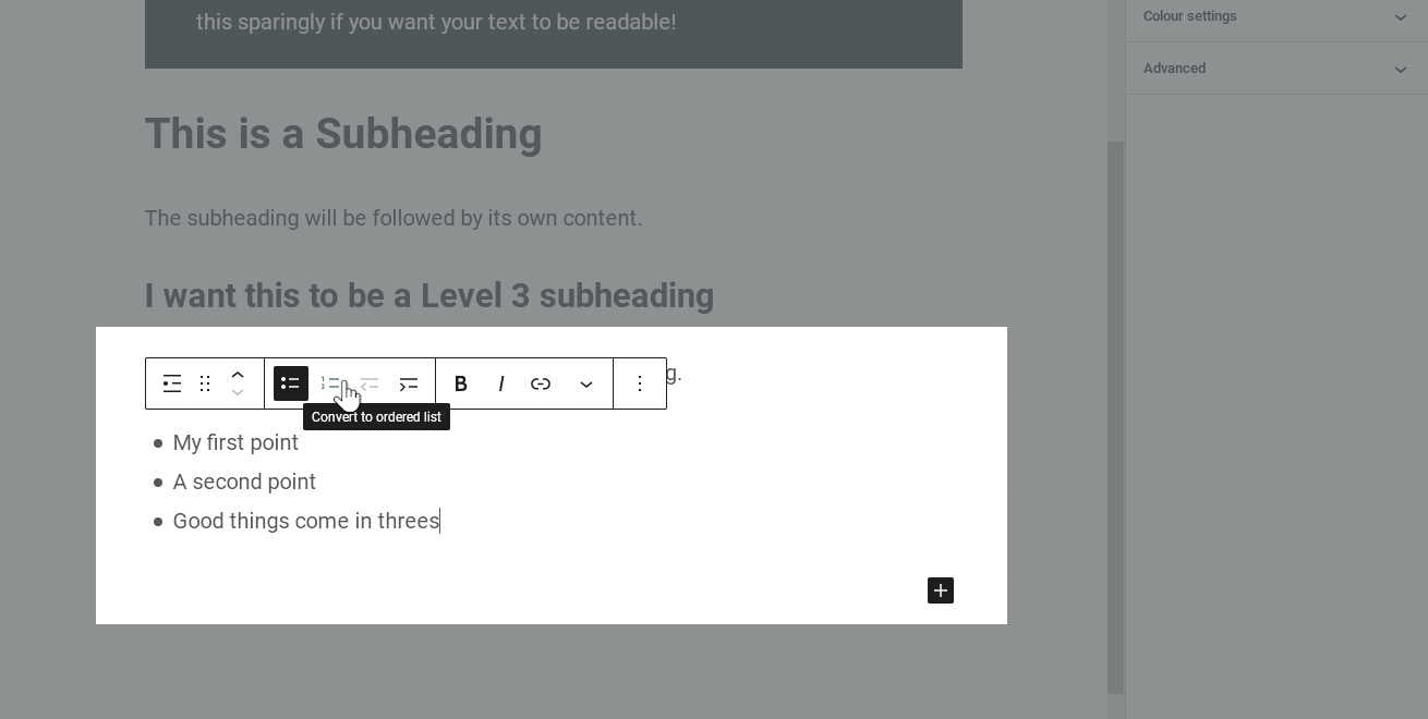
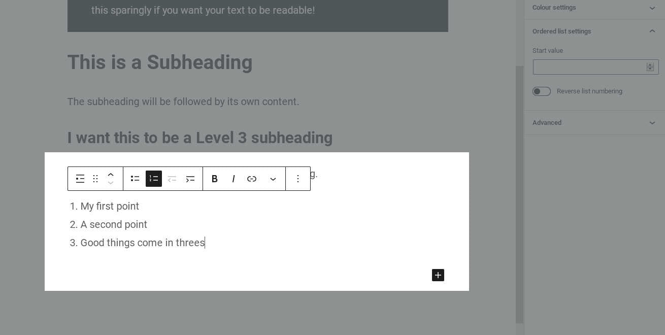
The default List block uses bullet points, and is called an “unordered” list. However, sometimes when our items are in a specific order, we would rather have numbering instead of bullets. This is called an “ordered” list.
Switching between the list types is very easy. In the toolbar above our List block, we simply click the button for the list type we prefer.
%22%20transform%3D%22translate(2.6%202.6)%20scale(5.11719)%22%20fill-opacity%3D%22.5%22%3E%3Cpath%20fill%3D%22%23ebebeb%22%20d%3D%22M170%20133.6L18.3%20144.2%2012%2054.4l151.7-10.6z%22%2F%3E%3Cellipse%20fill%3D%22%23666%22%20rx%3D%221%22%20ry%3D%221%22%20transform%3D%22matrix(193.33806%209.59922%20-1.18076%2023.78175%20175.3%2019)%22%2F%3E%3Cellipse%20fill%3D%22%23f2f2f2%22%20rx%3D%221%22%20ry%3D%221%22%20transform%3D%22rotate(85.6%207.6%2097.7)%20scale(19.1758%2052.49444)%22%2F%3E%3Cellipse%20fill%3D%22%23b0b0b0%22%20cx%3D%22144%22%20cy%3D%2242%22%20rx%3D%2270%22%20ry%3D%2219%22%2F%3E%3C%2Fg%3E%3C%2Fsvg%3E)
Converting our List block from an unordered list to ordered list %22%20transform%3D%22translate(2.6%202.6)%20scale(5.11719)%22%20fill-opacity%3D%22.5%22%3E%3Cellipse%20fill%3D%22%23ededed%22%20rx%3D%221%22%20ry%3D%221%22%20transform%3D%22rotate(-3.2%201636.2%20-1628.5)%20scale(86.97566%2044.59676)%22%2F%3E%3Cellipse%20fill%3D%22%23686868%22%20rx%3D%221%22%20ry%3D%221%22%20transform%3D%22rotate(-83.3%2091%20-89)%20scale(35.74742%20255.00001)%22%2F%3E%3Cellipse%20fill%3D%22%23646464%22%20cx%3D%22239%22%20cy%3D%2259%22%20rx%3D%2231%22%20ry%3D%2215%22%2F%3E%3Cellipse%20fill%3D%22%23f4f4f4%22%20rx%3D%221%22%20ry%3D%221%22%20transform%3D%22matrix(.17503%2020.05663%20-56.79877%20.49568%20103.1%2082.4)%22%2F%3E%3C%2Fg%3E%3C%2Fsvg%3E)
Our list block is now an ordered list
Multi-Level Lists
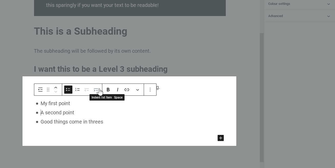
We might also need to create a list with a sub-level inside it. We can do this by indenting one or more of our list items. This button is also located on our List block toolbar.
First, we need to make sure our text cursor is placed on the line we want to indent (or that we have the lines selected, if we want more than one). Then, we click the “Indent List Item” button.
Our list now has two separate levels. We can add more items to the sub-list by pressing enter while our cursor is on an indented row, or continue to add items to the top-level list as before. We can add sub-lists under as many top-level list items as we like.
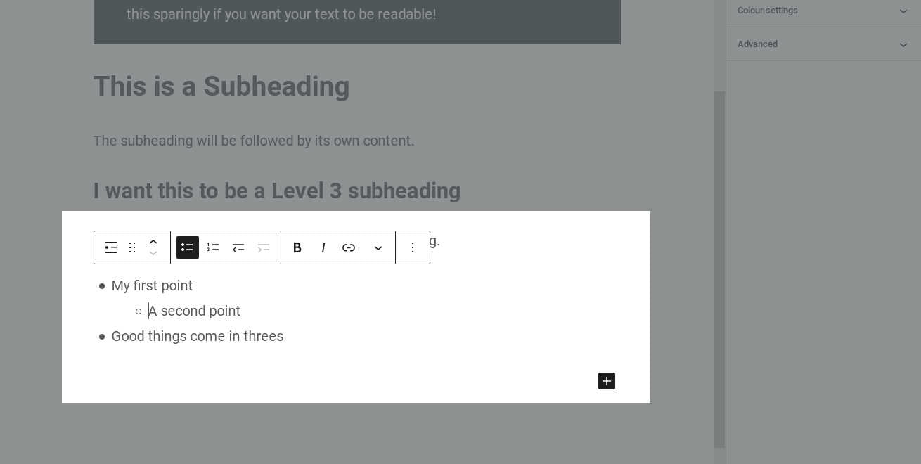
We can indent rows even further if we need more levels in our list, or we can click the “Outdent List Item” button to return an indented row to the previous level. We can also set a different list type for each sub-list, if we like. For example, we could have a top-level list which is ordered, and under each item have a sub-list using bullet points.
What’s Next?
We now know the basics of working with a variety of text-based content blocks. If you’re ready to move on to images, the tutorial continues in Part 3: Working with Attachments.